
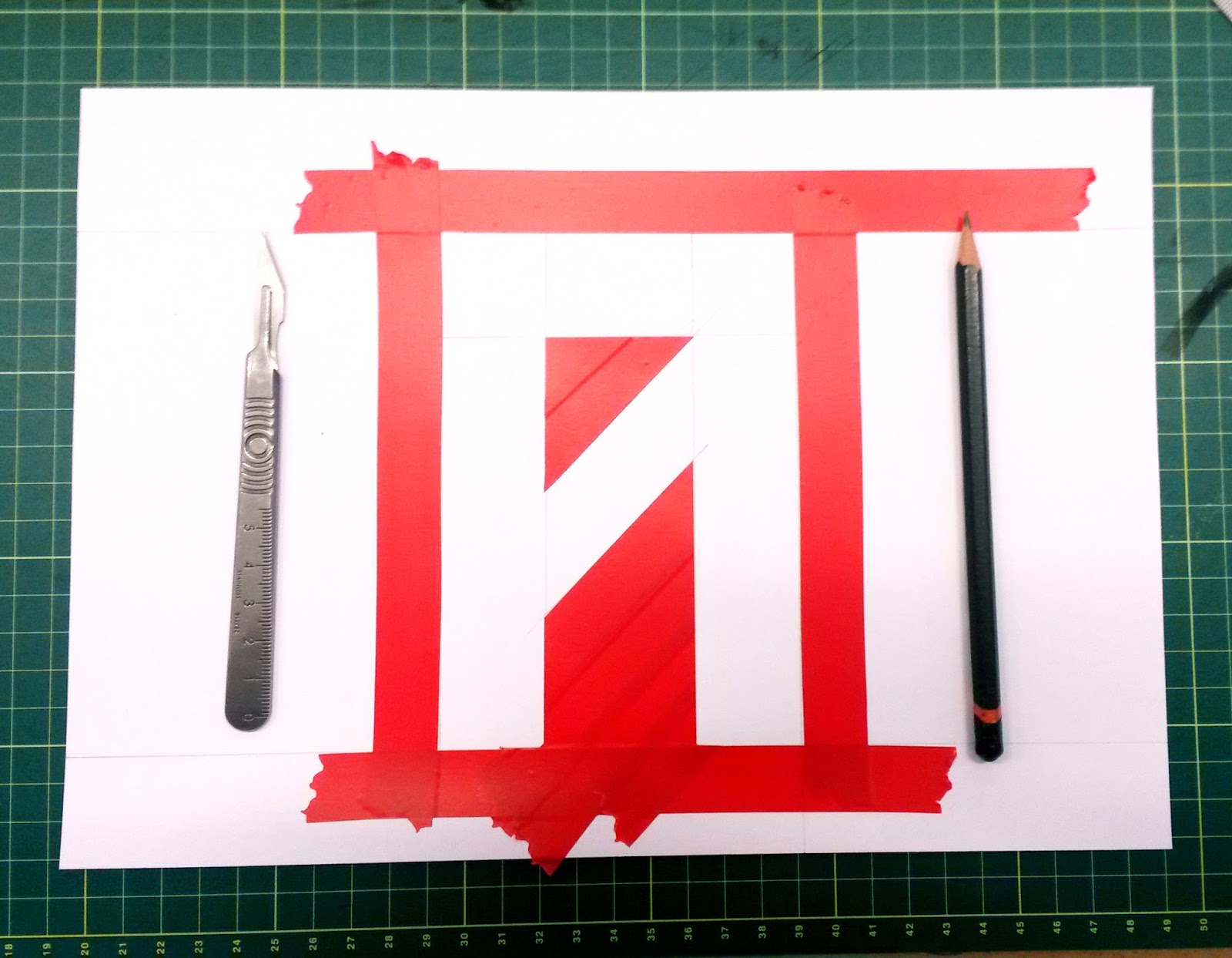


I wanted to create quite a stiff and restrictive typeface like this simply because I has never done it before so I wanted to try it out. It has a grungy and edgy look which is a nice break to the swiss typefaces I typically use. I created the larger versions of these letters on A4 sheets of paper using a simple hand printing method. I would simply mask out the edges of the sketched letters and drag ink across the page, then once I peeled back the mask what was left was an imperfect grungy typeface with uneven surfaces and a range of colours and densities of ink.
Another grid based typeface I like the look of which I think subconsciously inspired my own design was the recent identity of Wilsons Republic designed by Aiden Nolan.

The next step for this project is to expand this 4x4 grid into an even larger format whilst maintaining this structure. And to achieve this I will need to re-think my printing methods to adapt to this larger size.
No comments:
Post a Comment