Showing posts with label Physical Studio. Show all posts

Wednesday, 16 March 2016

3D Type "Woodwork"


Following from the last session in which I engraved the wood "Woodwork" into a hardwood log I had prepared earlier, I then burned and charred the surface and picked out the centre of the letters to give a light and dark contrast between the background and the content. I had to be careful not to chip too much away as I made a few mistakes and took chunks out of he counters and whitespace in-between the letters.


I then cut out the log and knife from the images I took and proceed to greatly manipulate the colours and contrast till I got this contemporary bright RGB colour with plenty of empty white. I also added some type and background embellishments. I like the contemporary style which I have created with something which is considered quite primitive and traditional as woodwork.

Monday, 22 February 2016

3D Type - Woodwork


For this workshop I was asked to think outside of the box and create some 3D typography that was explorative, cost effective and visually intriguing. So I came up with the idea to do some woodwork and to somehow mark my typography onto the wood. So I first stripped a hardwood log down to some clean wood and sanded it to a smooth finish. Doing this with hardwood was more difficult than it would have been with softwood but I did not have access to any softwood.

I then took a screwdriver and with a hammer I chiseled the letters by following a stencil. To everyones misery this made a lot of noise. I had to be careful not to make the wood split or for the counters in the middle of the letters to chip away. To finish I picked embedded paper out of the wood and chipped some more wood away to give the letters more definition and 3D presence.

The next step will be to sand down the surface once again so it is comfortable to touch, and then burn the chiseled areas to emphasise the letters more. I will need to be careful about controlling the burning so I don't just set the whole log on fire, and with the sanding I need to be careful and not chip the counters and delicate corners away.

Wednesday, 28 October 2015

Process and Production Typeface Design


These series of sketches was a result of a process and production task given to us where constrained within a four by four A4 grid. We had to fill each block with a phrase beginning with "I am", this filled the grid and created am interesting type structure. I started off drawing very precise letters with a compass and technical drawing tools, this was a bad start in the wrong direction. We were given this task in the hope we were loose with our ideas and thus allowing us to explore areas we were unfamiliar with. I decided to take influence from the rectangles in the grid and create a rectangular type form, this not only looks stylish but it is a great style to use for teens and young adults due to its.This encouragement to use new materials was informed more when it came to the second phase

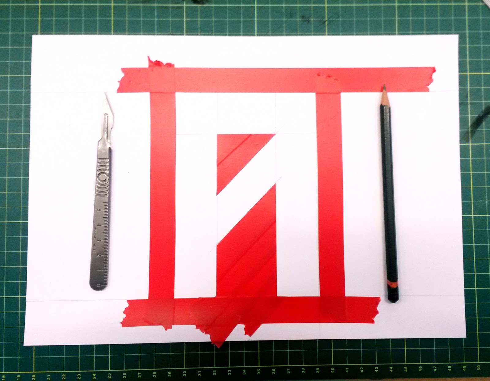
I wanted to create quite a stiff and restrictive typeface like this simply because I has never done it before so I wanted to try it out. It has a grungy and edgy look which is a nice break to the swiss typefaces I typically use. I created the larger versions of these letters on A4 sheets of paper using a simple hand printing method. I would simply mask out the edges of the sketched letters and drag ink across the page, then once I peeled back the mask what was left was an imperfect grungy typeface with uneven surfaces and a range of colours and densities of ink.

Another grid based typeface I like the look of which I think subconsciously inspired my own design was the recent identity of Wilsons Republic designed by Aiden Nolan.


The next step for this project is to expand this 4x4 grid into an even larger format whilst maintaining this structure. And to achieve this I will need to re-think my printing methods to adapt to this larger size.