Showing posts with label Process and Production 2. Show all posts
Monday, 9 May 2016
Cinema 4D Bottle Designs - Expanded
Following the workshop on designing and prototyping bottle labels I decided to come up with another design. I just wanted to experiment a little more with 3D, especially materials, so I took this opportunity to look at different bottle textures as well as applying a new design.
Wednesday, 20 April 2016
Helvetica Beer
In this tutorial I learnt how to use Cinema 4D as a prototyping tool. I began by importing the outline of the side of the can in preparation to use the lathe tool.I then started to create the material for the can, I set up the reflection first by using the legacy mode and applying a fresnel and other material properties. I then imported the map image onto the material and changed its projection settings to cylindrical, and then set the tag to fit to the can shape. I then added the fill and key light and placed them in the right place to create a soft shadow. I also added a room light to brighten the scene. In the render settings I also tweaked the Anti Aliasing to soften the diagonal lines. At this point I was noticing some streaking where the subdivisions were and no one could figure out what was causing the problem other than a possible fault with the graphics card, so I rendered out what I had and planned to move to another machine later.
The next project was to do something similar but with a bottle shape. So I brought int he line file and added a lathe to the bottle and the liquid layer. I set up the background and added a material. I then imported a preset glass texture and removed the roughness. I also tweaked some of the reflective parameters just to get the material just right. I also duplicated this material and changed the colour to act as my liquid, I applied this to the liquid lathe. To begin placing the elliptical label I first created a cylinder the same radius as the bottle. I created a material alpha channel and imported a beer label .png. Creating the cap would be a little complicated, to create this I used a series of stars and circle splines, I then included them into a loft and moved the circles up to create a crude cap shape. I then added a material like I did with the bottle. I then imported the cap and placed it onto the bottle.
Wednesday, 13 April 2016
Tutorial Showcase 2015
Tutorial Showcase 2015 from Emma Nicholson on Vimeo.
With my showreel I decided to keep the editing to a minimum, so swipes and roll in effects have not been included. I wanted a quick snappy and straightforward presentation of my work which is a style I have seen with professional showreels. I personally think transitions and text effects bloat out the animation and slow the pace so this is why I left them out. I started by placing my audio in and marking the beat on the timeline which gave me a loose guide to follow. I then chose a typeface and colour for the starting frames which also gave me a template for the title frames during the main content of the animation. I then started placing my second best piece first and cutting the best parts to the music and including the titles, I did this for each of the five pieces until I had a rough and loose edit. I then neatened the cuts so they were exactly to the beat and the best parts of the work was shown, i made sure the flow and variation of clip lengths was solid and not too unstructured. When I was happy I found a good cut off point for the audio and added an end screen similar to the starting one.
Music: http://www.bensound.com
Wednesday, 16 March 2016
3D Type "Woodwork"
Following from the last session in which I engraved the wood "Woodwork" into a hardwood log I had prepared earlier, I then burned and charred the surface and picked out the centre of the letters to give a light and dark contrast between the background and the content. I had to be careful not to chip too much away as I made a few mistakes and took chunks out of he counters and whitespace in-between the letters.
I then cut out the log and knife from the images I took and proceed to greatly manipulate the colours and contrast till I got this contemporary bright RGB colour with plenty of empty white. I also added some type and background embellishments. I like the contemporary style which I have created with something which is considered quite primitive and traditional as woodwork.
Wednesday, 9 March 2016
Cinema 4D, Type Design and Colour Exploration... All in One
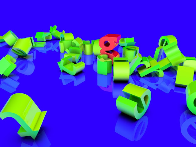
In todays Process and Production lesson we were using Cinema 4D to create 2D graphics. During the session we created a letter and experimented with reflective materials and realistic shadows etc. This is when I realised this was an amazing way to display typography and would fit perfectly with my Letter Sketching project I have going, so I took a letter I created a while back, along with one of the colours I was creating yesterday...and created this amazing and vibrant 3D image! This is the first time I have pulled my personal work, Production work and my contextual portfolio all together and really had fun with it. I will likely use this 3D template for future and re-visited letters.
Cinema 4D Lesson Two
So I started by creating the project folder and drawing a rectangle in Cinema 4D. I extruded the rectangle to 5000cm, I also added some subdivisions and changed the viewport so the segments were visible. I removed the caps of either end of the rectangle to make it into a tube. Considering the hierarchy of objects in Cinema 4D, I added a twist object into the extrude object and played with he parameters. So now I had a long twisted tube I could look down. I created a luminent checkerboard texture and applied it to the tube, when I look down the tube now it looks like a hypnotic tunnel. The lines of the texture looked a little odd and bent, so I had to go back into the rectangle object and change the Intermediate points setting to subdivided. I used similar tools to then create a sphere. I also added a reflection to my sphere making sure I include the Fresnel texture. I then changed the render settings, including some tweaks to Anti Aliasing, then rendered the final image. I did a second render where I added the Ambient Occlusion effect which adds tiny shadows to corners and crevices. This gives the scene a greater 3D and lifelike presence.
The next step is to add a particle system which will add dynamic movement and randomness to my image. I added the particle emitter object and changed its position. I fiddled with some of the parameters of the emitter and also added the sphere so the emitter spits out random spheres which rotates and travels in any direction. I then added some collision physics to the tube and the square. Now unfortunately gravity is having an effect on the sphere so they just fall to the floor, so I just turned gravity off.
Then it was time to try something new, so I created a new file and added a floor and background with a compositing tag. I then added a letter with the MoText tool. I added some fillet caps for smooth edges and adjusted the font and size. I created some ruminant and reflective gradient materials. I added and experimented with colours, reflections and gradients until I came to a nice looking combo between the background and the letter. I then drew a phrase and added a cloning object. I will be dropping the letters from this sentence onto the one letter I created earlier. I added some dynamics to the object like in the first exercise.
I then decided to also render this sequence as a QuickTime film.
Monday, 22 February 2016
3D Type - Woodwork
For this workshop I was asked to think outside of the box and create some 3D typography that was explorative, cost effective and visually intriguing. So I came up with the idea to do some woodwork and to somehow mark my typography onto the wood. So I first stripped a hardwood log down to some clean wood and sanded it to a smooth finish. Doing this with hardwood was more difficult than it would have been with softwood but I did not have access to any softwood.
I then took a screwdriver and with a hammer I chiseled the letters by following a stencil. To everyones misery this made a lot of noise. I had to be careful not to make the wood split or for the counters in the middle of the letters to chip away. To finish I picked embedded paper out of the wood and chipped some more wood away to give the letters more definition and 3D presence.
The next step will be to sand down the surface once again so it is comfortable to touch, and then burn the chiseled areas to emphasise the letters more. I will need to be careful about controlling the burning so I don't just set the whole log on fire, and with the sanding I need to be careful and not chip the counters and delicate corners away.
Saturday, 20 February 2016
This tutorial was the first time I have used cinema 4D, however I have used other 3D software like 3Ds Max and SketchUp. I quickly set up a project document and familiarise myself with all the tool which are similar to the other 3D software I have used. I created some quick Illustrator artwork and made sure to save it as an Illustrator 8 format, this makes it compatible to export into Cinema 4D. When creating my artwork I also have to make sure I was importing closed shapes, otherwise when I convert them into 3D object it will only effect the stroke.
I used the extrude tool to pull the shape along the z axis and make it a 3D object, I also added some very subtle curved edges to make it softer and pleasing on the eye. The next step was to set up an environment in which to place and capture my 3D object, imagine it like setting up a photography studio. I created a floor and background and make them the same colour to give the endless slope effect. To add the colour I needed to create a material which I can then apply to the shapes, so I created each colour I would be using and applied it.
I then created a camera and two lights and set them up in a way that created soft and shallow shadows. I set the camera up to be looking down at an angle, this is a typical product photography frame. To add the camera object I set my perspective viewport up to where I wanted the camera, then created the object, the camera object is placed in exactly my position of perspective. To finish I added some atmospheric lighting effects and exported the frame as a JPEG.
Red Riding Hood Infographic
Red Riding Hood Infographic from Emma Nicholson on Vimeo.
For this tutorial I would be creating two scenes from a fairytale which showcase facts and figures from the story. I drew my two scenes and an additional this which will be used in the middle as a scene wipe between the two. I used simple colours and shapes to represent the two characters, Little Red Riding Hood and the Big Bad Wolf as colour is a key part of the story (for example the emphasis on Red Riding Hoods red cloak).
I imported the two main scenes into After Effects as two separate five second compositions. I created the text in After Effects int he case I want to add effects later. These effects could include the preset effects, the common ones used are the animate in and out effects.
For my transition I decided not to use the wipe, but to create a click effect where a button is pressed, and on release it snaps to the next scene. I made a few adjustments as it was slow and sluggish at first and did not have the snappy click motion I wanted. I also made adjustments to the transition of text to give it a comfortable pace to be read.
To finish I combined both comps in a ten second render composition. I checked the transition was smooth and then rendered to HD.
Monday, 15 February 2016
Moving Cameras in 3D space
InDesign Construction from Emma Nicholson on Vimeo.
For this project I decided to take a different spin on it and potentially break a fourth wall. Here I disassembled a typical InDesign document and created artwork on separate layers ready to import into After Effects.
*Side note: editing what looked like an InDesign document in After Effects, whilst the real InDesign was open in the background was quite disorientating, but pretty funny when someone tried to figure out what was going on on screen when they walked past.
So I imported my Illustrator file into After Effects and set the layers to work in 3D space. I adjusted my workspace to show two viewports, one birds eye view so I could see where my objects where placed in relation to each other, and the other a perspective view so I could see what would be the final output. I then set the objects apart on the new y axis and created a camera layer. The camera layer started around the middle of the y axis, I then moved it all the way back over the course of the animation. This gave the impression that as the camera was zooming out, elements of the InDesign document were moving and being set into place. It took a lot of adjustment to get an intriguing angle and speed of movement, but I learnt that the most effective way was to place all my objects on the final frame and work backwards from there.
From there I was also shown the page turn effect which I used on the page element int he InDesign document, so the 'paper' was being placed int he InDesign document like it would onto a real desk.
For this project I decided to take a different spin on it and potentially break a fourth wall. Here I disassembled a typical InDesign document and created artwork on separate layers ready to import into After Effects.
*Side note: editing what looked like an InDesign document in After Effects, whilst the real InDesign was open in the background was quite disorientating, but pretty funny when someone tried to figure out what was going on on screen when they walked past.
So I imported my Illustrator file into After Effects and set the layers to work in 3D space. I adjusted my workspace to show two viewports, one birds eye view so I could see where my objects where placed in relation to each other, and the other a perspective view so I could see what would be the final output. I then set the objects apart on the new y axis and created a camera layer. The camera layer started around the middle of the y axis, I then moved it all the way back over the course of the animation. This gave the impression that as the camera was zooming out, elements of the InDesign document were moving and being set into place. It took a lot of adjustment to get an intriguing angle and speed of movement, but I learnt that the most effective way was to place all my objects on the final frame and work backwards from there.
From there I was also shown the page turn effect which I used on the page element int he InDesign document, so the 'paper' was being placed int he InDesign document like it would onto a real desk.
Animating Sketches - After Effects
Sketched Type Animation from Emma Nicholson on Vimeo.
In this workshop I was shown how to take a range of sketches which look the same (however have slight variations because I can not possibly draw exactly the same without assistance) and create an animated illustration which has natural organic movement.
The first step was to process my sketches so I scanned them in and removed all colour information plus I re-defines the white, black and grey tones to give the line art more definition. I then imported the image into After Effects where I adjusted how many frames each drawing lasted, essentially speeding up or slowing down the effect. Then using the pen tool I drew over the letters, this does not make a mark on the composition, but generates information for an effect to follow. I then applied the stroke effect to the path which reveals the sketch underneath gradually, giving the impression the words are drawing themselves. I tweaked the width of the effect to ensure it covered the pencil lines, and I adjusted things like the speed of the effect to get a natural appearing drawing motion. I then added a slight wiggle effect to the background to give it some organic movement to match the illustration.
In this workshop I was shown how to take a range of sketches which look the same (however have slight variations because I can not possibly draw exactly the same without assistance) and create an animated illustration which has natural organic movement.
The first step was to process my sketches so I scanned them in and removed all colour information plus I re-defines the white, black and grey tones to give the line art more definition. I then imported the image into After Effects where I adjusted how many frames each drawing lasted, essentially speeding up or slowing down the effect. Then using the pen tool I drew over the letters, this does not make a mark on the composition, but generates information for an effect to follow. I then applied the stroke effect to the path which reveals the sketch underneath gradually, giving the impression the words are drawing themselves. I tweaked the width of the effect to ensure it covered the pencil lines, and I adjusted things like the speed of the effect to get a natural appearing drawing motion. I then added a slight wiggle effect to the background to give it some organic movement to match the illustration.
Tuesday, 26 January 2016
Glob Cereal
Above are the first prototypes of my cereal box. The design itself was pretty simple and created on Adobe Illustrator, as my character was made from basic shapes and colours it made it easy for me to change colours and experiment with the best character and background colour combinations. I decided on this sickly green and purple combination to fit the personality of Glob the monster.
Monday, 2 November 2015
Character Design
For this task we were asked to draw some rough sketches for a new character which we would be using for a serial box design. This was only an idea development stage so the sketches I did at first were very quick and basic, just to get my ideas down to develop from.
One character I came up with was this half drawn stick figure, it would possibly have a pencil shown drawing it too and the tag line would be 'creating your own world' or 'create your day'. This idea was good however it did not leave any opportunity for bright colours or interesting shapes for the character, as the stick figure is only made of the most primitive shapes and is typically black, and trying to re-invent the stick figure would ruin the simplicity of it. So I moved on.
My next idea was a large rounded character called Glob, he has a friendly monster style with his non threatening facial features but chinky legs and large teeth. His expression is plain which gives him a simpleton look that would be lovable like a pet. I loved this idea and could already picture him taking over most of the area of a serial box, building on the perception of his big size, so I carried the idea forward and developed the sketches.
I fine tuned the shape of his body and reversed it to see which I preferred, I tired multiple facial expressions and I also drew his body under the force of movement. And after the experimentation I still went with my original blank expression, closed mouth appearance. I then started to draw some mockups of the cereal boxes, following my earlier idea to have him covering most of the box and then having the typography look like it is struggling to fit around him, like it is being squashed against the side.
Wednesday, 28 October 2015
Rotoscoping Street Dancer from Emma Nicholson on Vimeo.
For this exercise we were being shown how to rotoscope a clip and place it into a chosen scene. And for this I needed a short clip of a moving figure with no overlapping of other people or parts of the foreground etc. Then I had to find a looping point int he movement.
Initially we trimmed down the clip to its looping point which for me was about 1.7 seconds. Then to seam;essay stretch it out to two seconds we performed a Time Stretch which adds duplicate keyframes to extend the clip.
We then created an initial mask using the pen tool of the clearest part of the clip, ideally one where the subjects limbs were extended out clearly. I then step by step adjusted this mask to match each keyframe so the sequence was completely removed from the background. One glitch I occurred was the mask in the gab between the duplicate keyframes was randomly generated by After Effects to move from one keyframe to another, not knowing the keyframes are duplicates.So to fix this I enabled the 'Hold Keyframes' options and the mask kept its form until it was manually changed.
Another issue with After Effects is that the lest keyframe is always blank so before the clip loops it flashes off for one frame before starting again. To fix this I had to perform a Time Remap where I moved the endpoint to the next to last keyframe and trimmed the excess on the end. And now my clip looped seamlessly. I could also extend the two second clip to the whole ten seconds now. For this to work I added a simple Loop Out Duration expression into the expression dialogue box.
My Rotoscope was now ready to be added into the scene, for which I have chosen a London street with a large part of clear road where my character will seemingly be dancing. I gave the background a wiggle effect which I learnt from my last tutorial and this gave the background some life which lifted it off the ground.
Process and Production Typeface Design
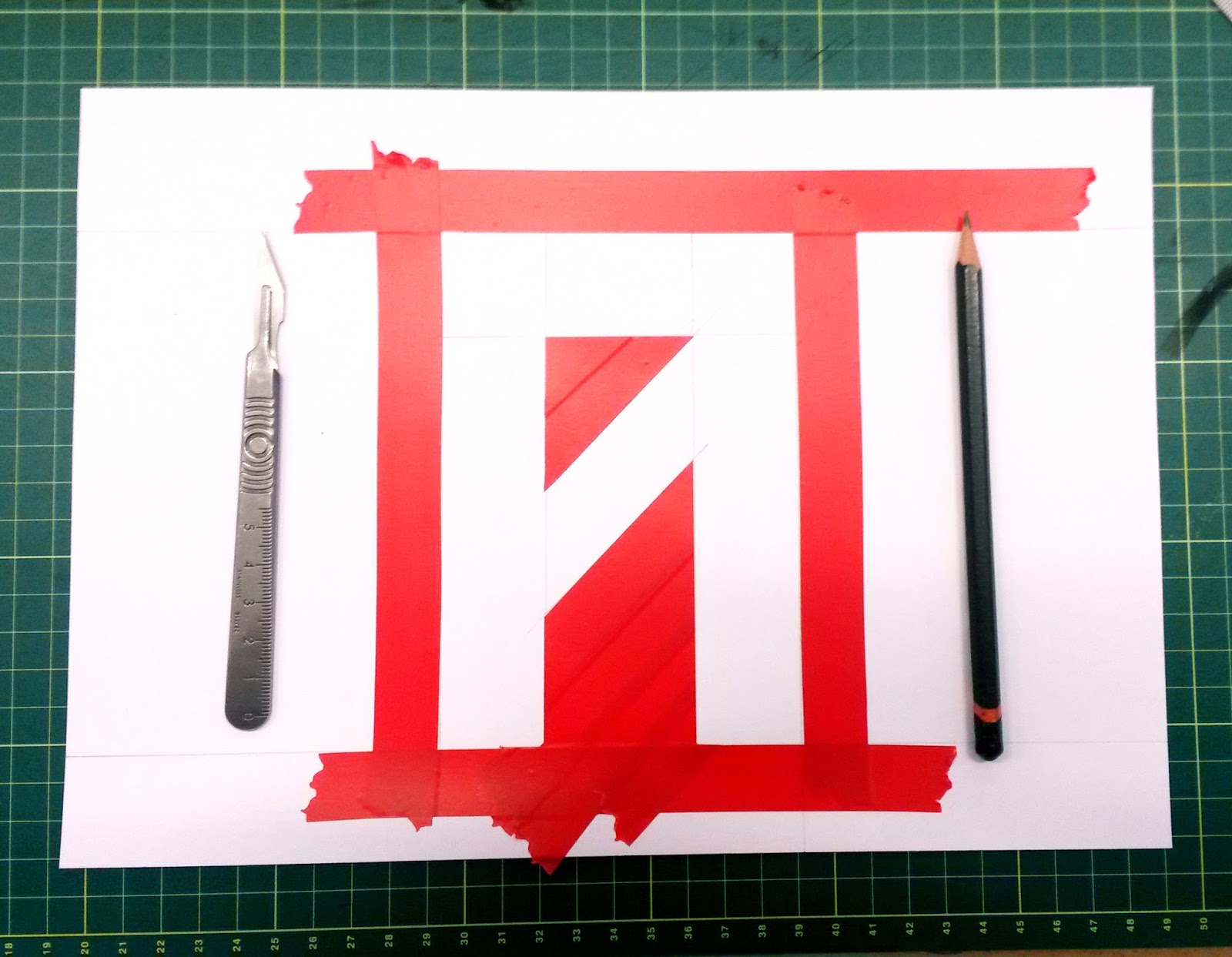
I wanted to create quite a stiff and restrictive typeface like this simply because I has never done it before so I wanted to try it out. It has a grungy and edgy look which is a nice break to the swiss typefaces I typically use. I created the larger versions of these letters on A4 sheets of paper using a simple hand printing method. I would simply mask out the edges of the sketched letters and drag ink across the page, then once I peeled back the mask what was left was an imperfect grungy typeface with uneven surfaces and a range of colours and densities of ink.
Another grid based typeface I like the look of which I think subconsciously inspired my own design was the recent identity of Wilsons Republic designed by Aiden Nolan.
The next step for this project is to expand this 4x4 grid into an even larger format whilst maintaining this structure. And to achieve this I will need to re-think my printing methods to adapt to this larger size.
Monday, 26 October 2015
Portrait Animation
Portrait Animation from Emma Nicholson on Vimeo.
For this tutorial I was asked to prepare a vector drawn portrait of a person that was 1920x1080 and has a number of separate limbs I can animate independently to create a vast range of movement.
One technique I will be using is a living hold and it is used when action in an animation has stopped but the animation is still running through the timeline. For example a subtitle will appear on the screen but will have no animated movement so to make sure the animation does not look frozen or buffering a small moving feature is added like a lens flare or moving texture so there is a subtle element of movement that indicates the passing of time on the animation.
I was told a tip about pacing an animation. If I have a contrast between fast intense scenes with eh odd gentle undertone to create a strong structure within the story.
I am also told we will need to ensure our motion loops seamlessly.
Right so from here I am ready to start, so I created my document and imported the content and set it all in the timeline. I rigged each element up, correcting their anchor points so their movement is natural at the usual joints.
After I had a basic keyframe animation set up for ten seconds I began adding a living hold to some elements using the wiggler function, who’s setting can be found in the window menu. This function adds random movement at a magnitude of my choice, in my case I chose a very small magnitude to add just a minimal range of movement to make my human portrait seem more alive. This adds a level of realism as living things can not hold perfectly still. This feature is also helpful for not animated elements such as backgrounds as adding a subtle amount of movement brings them forward slightly into the animation, merging the foreground and background.
As I added the wiggle to some of my layers I encountered a bug. As the layers were 3D they had 3 axis of movement, so when I added the wiggle it moved the z axis too so the layers move forward and behind each other making them appear to flash on and off screen. So to solve this I selected just one axis of movement, if I wanted another axis I would have to create a second wiggle effect to that axis.
Another feature I was shown was using Javascript to program my animation. To open the edit window I had to alt+click the layer and begin adding expressions. The default code is transform.position. This form of editing is good for complete control whereas the wiggle feature is a completely random outcome.
A handy tip for working with long animations is to create the base product, which is simply the animated objects, before stylising them. This is an efficient way of working as you always have a full product early on and are only making it better after that.
So once I had added some final touches to the animation which included the addition of some textures, I finally ensured the loop was seamless and I finished the animation and rendered it out.
Adding the textures was a simple process, I imported the texture, used an alpha track which is similar to how a clipping mask works in illustrator. This replaced the solid colour with the texture. I then adjusted the opacity of the solid colour and added the multiply blending mode to make the texture more subtle and the colour I wanted.
Subscribe to:
Posts (Atom)