
Wednesday, 16 March 2016
Contemporary Colours
3D Type "Woodwork"

Following from the last session in which I engraved the wood "Woodwork" into a hardwood log I had prepared earlier, I then burned and charred the surface and picked out the centre of the letters to give a light and dark contrast between the background and the content. I had to be careful not to chip too much away as I made a few mistakes and took chunks out of he counters and whitespace in-between the letters.


I then cut out the log and knife from the images I took and proceed to greatly manipulate the colours and contrast till I got this contemporary bright RGB colour with plenty of empty white. I also added some type and background embellishments. I like the contemporary style which I have created with something which is considered quite primitive and traditional as woodwork.
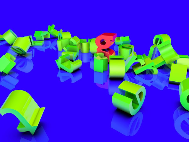
Wednesday, 9 March 2016
Cinema 4D, Type Design and Colour Exploration... All in One

In todays Process and Production lesson we were using Cinema 4D to create 2D graphics. During the session we created a letter and experimented with reflective materials and realistic shadows etc. This is when I realised this was an amazing way to display typography and would fit perfectly with my Letter Sketching project I have going, so I took a letter I created a while back, along with one of the colours I was creating yesterday...and created this amazing and vibrant 3D image! This is the first time I have pulled my personal work, Production work and my contextual portfolio all together and really had fun with it. I will likely use this 3D template for future and re-visited letters.
Cinema 4D Lesson Two


The next step is to add a particle system which will add dynamic movement and randomness to my image. I added the particle emitter object and changed its position. I fiddled with some of the parameters of the emitter and also added the sphere so the emitter spits out random spheres which rotates and travels in any direction. I then added some collision physics to the tube and the square. Now unfortunately gravity is having an effect on the sphere so they just fall to the floor, so I just turned gravity off.

Then it was time to try something new, so I created a new file and added a floor and background with a compositing tag. I then added a letter with the MoText tool. I added some fillet caps for smooth edges and adjusted the font and size. I created some ruminant and reflective gradient materials. I added and experimented with colours, reflections and gradients until I came to a nice looking combo between the background and the letter. I then drew a phrase and added a cloning object. I will be dropping the letters from this sentence onto the one letter I created earlier. I added some dynamics to the object like in the first exercise.
I then decided to also render this sequence as a QuickTime film.
I then decided to also render this sequence as a QuickTime film.
Tuesday, 8 March 2016
Colour Exploration/ Experimentation

Today I accidentally typed the wrong CMYK code and stumbled upon this first colour shown. I liked the pinkish hue which differentiated it against the commonly used R: 255 solid red which is so widely used, I thought this was a possible great alternative if I ever needed it. So I wrote the code down and looked into it later int he evening. I worked in RGB to try get as vibrant a colour as possible, rarely possible with just CMYK colourspace. I worked through a few different colours (shown advancing in numerical order), I was trying to find the delicate balance of the pink hue but maintaining the bold and dominating red which is achieved with he R: 255. I eventually came to an effective colour, what I will use it for in the future I do not know, but I have it archived ready.
Moveo Sans - Green Type
I recently discovered a letter from the Moveo Sans type family which I found interesting. Moveo Sans is a typeface from the Green Type Foundry based in Saint Petersburg.
 http://greentype.tumblr.com/post/140678208026
What I loved about this letter is as the bowl closes near the tail of the 'a'; it takes an abrupt corner and finished off as a straight line rather than continuing the curve. This sharp finishing broke looks stunning, it draws my eye. It is just such a tiny detail but something which I have not seen before and it adds a bucket-load of character to the character (sorry... couldn't resist the joke). It gives the letter its personality which is a staple for the rest of the typeface. Something about how small a detail it is and despite that it gives the letter so much personality, this is what I consider perfect type design.

What I loved about this letter is as the bowl closes near the tail of the 'a'; it takes an abrupt corner and finished off as a straight line rather than continuing the curve. This sharp finishing broke looks stunning, it draws my eye. It is just such a tiny detail but something which I have not seen before and it adds a bucket-load of character to the character (sorry... couldn't resist the joke). It gives the letter its personality which is a staple for the rest of the typeface. Something about how small a detail it is and despite that it gives the letter so much personality, this is what I consider perfect type design.
Subscribe to:
Comments (Atom)